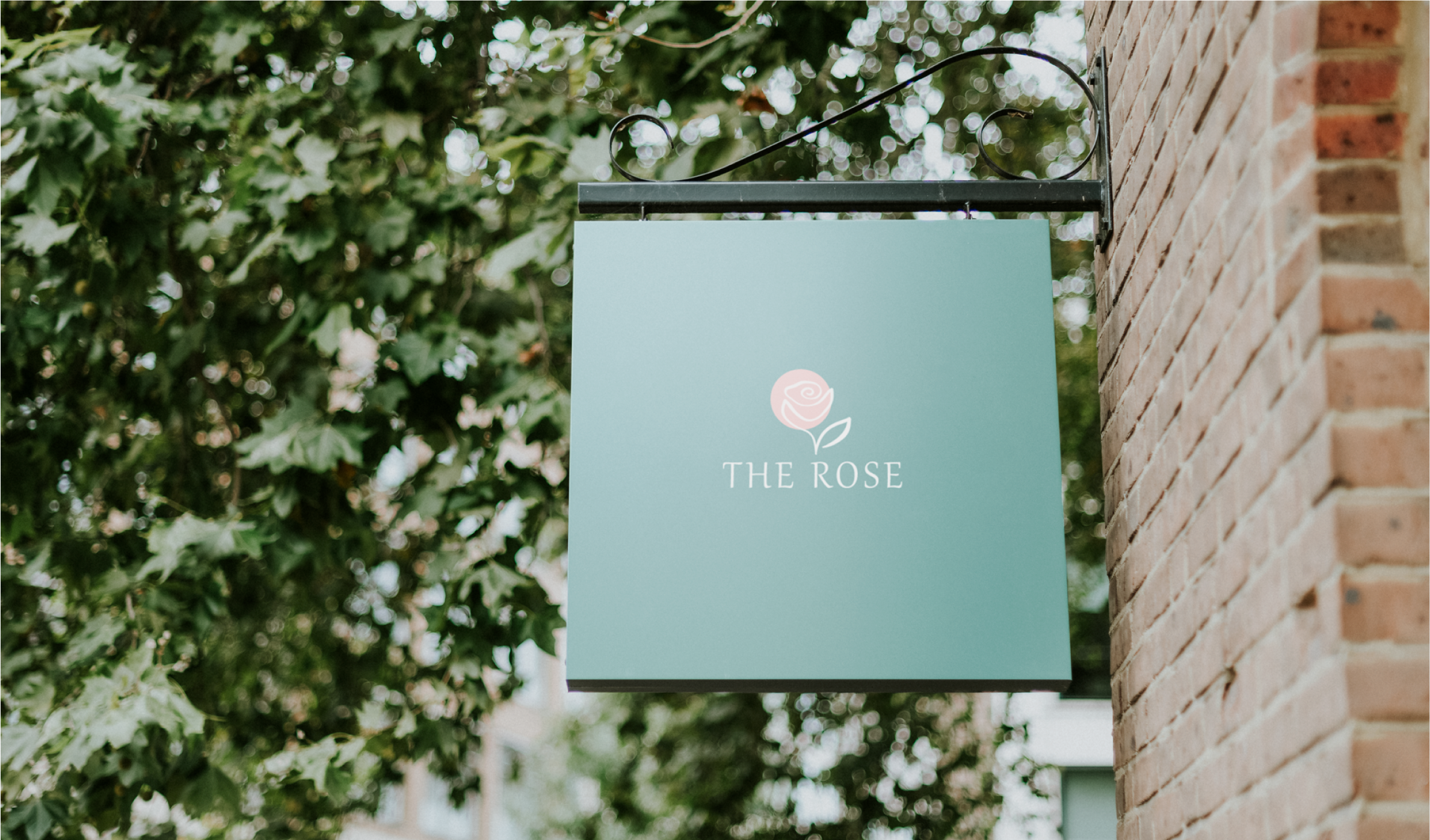
The “Thr Rose” logo project revolved around capturing the floral elegance of a downtown Georgia flower shop. The client expressed a desire for a logo that not only showcased the beauty of flowers but also conveyed a sense of sophistication and charm. Their request emphasised the importance of creating a design that would resonate with customers seeking quality floral arrangements.
01
Timeless Aesthetic
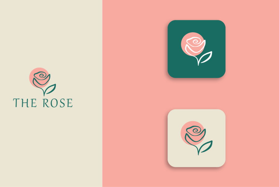
To fulfil the client’s desire for a timeless aesthetic, I focused on creating a design that transcends fleeting design trends. The logo stands as a symbol of enduring beauty, echoing the everlasting appeal of flowers and positioning “The Rose” as a trusted establishment in the downtown Georgia floral scene.
02
Community Connection
Given the downtown location, special attention was paid to creating a logo that fosters a sense of community connection. The design subtly incorporates elements that resonate with the local clientele, forging a visual link between “Thr Rose” and the vibrant heartbeat of Georgia’s downtown culture.

03
Approach to Logo Design
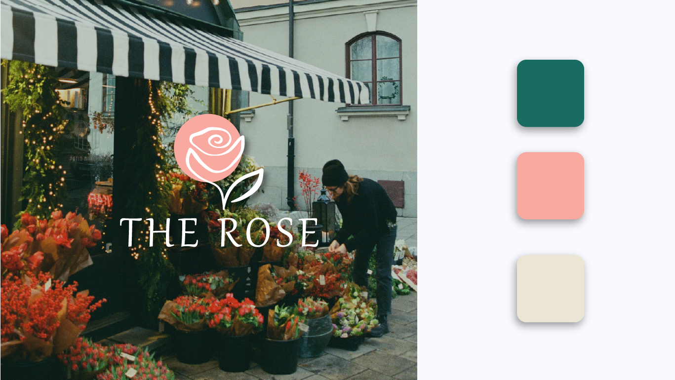
In approaching “The Rose” logo, I aimed to encapsulate the essence of the flower shop’s identity. Drawing inspiration from the rich variety of blooms, I crafted a design that harmoniously brought together elements of nature and sophistication. The chosen color palette reflects the vibrancy of flowers, while the overall composition exudes an aura of elegance.

